


Most HVAC shops don't have a data problem. They have a definitions problem.
Ask three people in the same company "what counts as a completed job?" and you'll get three different answers. The dispatcher thinks it's when the tech clicks "done." The office manager thinks it's when the invoice goes out. The owner thinks it's when the money clears. All three are looking at the same dashboard, all three trust it, and all three are quietly making decisions off numbers that mean different things.
That's the real reason so many HVAC dashboards get ignored after month two. Not because the charts are ugly. Because nobody can defend the number when it gets questioned in a meeting.
A HVAC service data taxonomy — a shared, written agreement on what every event, job, and part means, plus who owns each metric built on top of it — is what turns a pretty dashboard into something an ops leader can actually make a hiring, pricing, or territory call from. It's the plumbing underneath everything. Get it wrong and every downstream report inherits the mess.
Why definitions rot faster than data
Data quality gets all the attention. Definition quality is where the rot actually starts, and nobody talks about it.
Here's the pattern. A shop rolls out a new field app. Techs get told to tag jobs. For the first month, everyone tags carefully. Then summer hits, the phones don't stop, and tagging becomes whatever gets the tech to the next call fastest. "Maintenance," "repair," and "diagnostic" start blurring. Six months later the "PM revenue" number on the owner's dashboard includes a pile of repairs that got miscoded because the tech was standing on a hot roof at 2pm and just picked the first dropdown.
The data is technically clean — every field is filled in — but the meaning has drifted so far from reality that the number is worse than useless. It's confidently wrong.
-
No single owner for each metric. When everybody owns a number, nobody does.
-
Definitions live in people's heads, not in a document, so they shift every time staff turns over.
-
The people generating the data (techs, CSRs) never see the reports built from it, so there's no feedback loop telling them their tagging matters.
-
New job types get added ad hoc — someone creates "duct cleaning - commercial" as a one-off and suddenly there are two competing categories for the same work.
This is the same underlying issue behind a lot of the integration headaches covered in the HVAC integrations and data-architecture playbook — except here the problem isn't that systems can't talk to each other. It's that they're using the same words to mean different things.
The four layers of a service-data taxonomy
Before you can assign owners, you need to agree on what you're naming. Most shops jump straight to KPIs and skip the vocabulary underneath. That's backwards.
Eliminate scheduling chaos and missed jobs.
Coolyly helps HVAC companies book, coordinate, and track every service efficiently.
- Unified appointment & dispatch management
- Automated client notifications
- Technician scheduling & job tracking
No credit card required
Layer 1 — Events. The atomic stuff. "Tech arrived on site." "Part installed." "Customer approved quote." "Payment collected." These are timestamps and facts, not interpretations. If two people can disagree on whether an event happened, your taxonomy is broken at the foundation.
Layer 2 — Jobs. A job is a bundle of events with a type, a status, and an outcome. This is where most disagreement lives. Is a callback a new job or part of the original? Is a no-charge warranty visit even a "job"? Your job taxonomy has to answer these explicitly, in writing.
Layer 3 — Parts. What got used, what it cost, what it's compatible with, whether it was billable. Parts data is notoriously messy because techs improvise substitutions in the field. Your taxonomy needs canonical part identities that survive substitution.
Layer 4 — Metrics. Only now do you build the numbers: revenue per job, callback rate, PM conversion, first-time fix rate. Every metric should trace cleanly back to definitions in layers 1–3. If it can't, it's a made-up number.
The mistake almost everyone makes is building Layer 4 first — picking KPIs from a blog post or a competitor — and then reverse-engineering definitions to fit. That's how you end up with a "first-time fix rate" that nobody can explain and everyone quietly distrusts.
Metric ownership: the part that actually makes it stick
A taxonomy without owners is a document that dies in a shared drive.
-
The definition stays accurate and matches how the work actually happens.
-
The data feeding it is complete and trustworthy.
-
The number gets explained when someone questions it in a meeting.
Here's a simple ownership structure that works for shops from around 8 techs up to 60+:
| Metric | Owner | Feeds off (layer) | What "broken" looks like |
|---|---|---|---|
| First-time fix rate | Field/Service Manager | Job status + callback events | Callbacks tagged as new jobs |
| PM conversion rate | Sales/CSR Lead | Job type + quote events | Repairs miscoded as maintenance |
| Revenue per truck | Ops Manager | Job outcome + payment events | No-charge visits polluting averages |
| Parts margin | Purchasing/Inventory | Part cost + billable flag | Substituted parts not re-costed |
| Avg. response time | Dispatch Lead | Call-created + arrival events | Manual arrival timestamps entered late |
The key here: ownership should sit with the person closest to where the data is generated, not the person who most wants the report. The service manager owns first-time fix rate because they run the techs who create callbacks — they can actually fix the definition drift at the source. Handing that metric to the owner or a finance person means nobody can correct the underlying behavior.
This ties directly into the maturity ladder covered in the HVAC analytics maturity framework. You can't move up a level in analytics maturity until each metric has a defendable owner. Ownership is the prerequisite, not a nice-to-have.
Acceptance criteria: what "good enough to publish" actually means
Every metric needs written acceptance criteria — the conditions under which a number is allowed to appear on a dashboard as decision-grade. Without this, half-baked numbers leak into meetings and people make real calls off them.
Acceptance criteria for a metric usually cover:
-
Completeness threshold — e.g., "PM conversion rate only publishes if at least 95% of jobs that week have a valid job-type tag." Below that, the dashboard shows "insufficient data," not a fake number.
-
Freshness — how recent the underlying data must be. A response-time metric built on timestamps entered three days after the fact isn't decision-grade.
-
Source-of-truth rule — which system wins when two disagree. If dispatch says the tech arrived at 10:14 and the GPS says 10:31, which one feeds the metric? Decide once, write it down.
-
Exclusion rules — what gets left out. No-charge warranty visits excluded from revenue-per-job. Training days excluded from utilization.
A metric that doesn't meet its acceptance criteria shouldn't show a number at all. This feels harsh at first — owners hate seeing "insufficient data." But that friction is the point. It creates pressure to fix the data at the source instead of shipping garbage that looks authoritative.
Drift detection: catching definition rot before it lies to you
Definitions don't break loudly. They drift slowly, which is far more dangerous because you keep trusting the number the whole time it's going bad.
You need a handful of checks that watch for the signature of drift, not just missing data. A few that catch the most common HVAC problems:
Here's a quick visual of a drift-detection workflow.
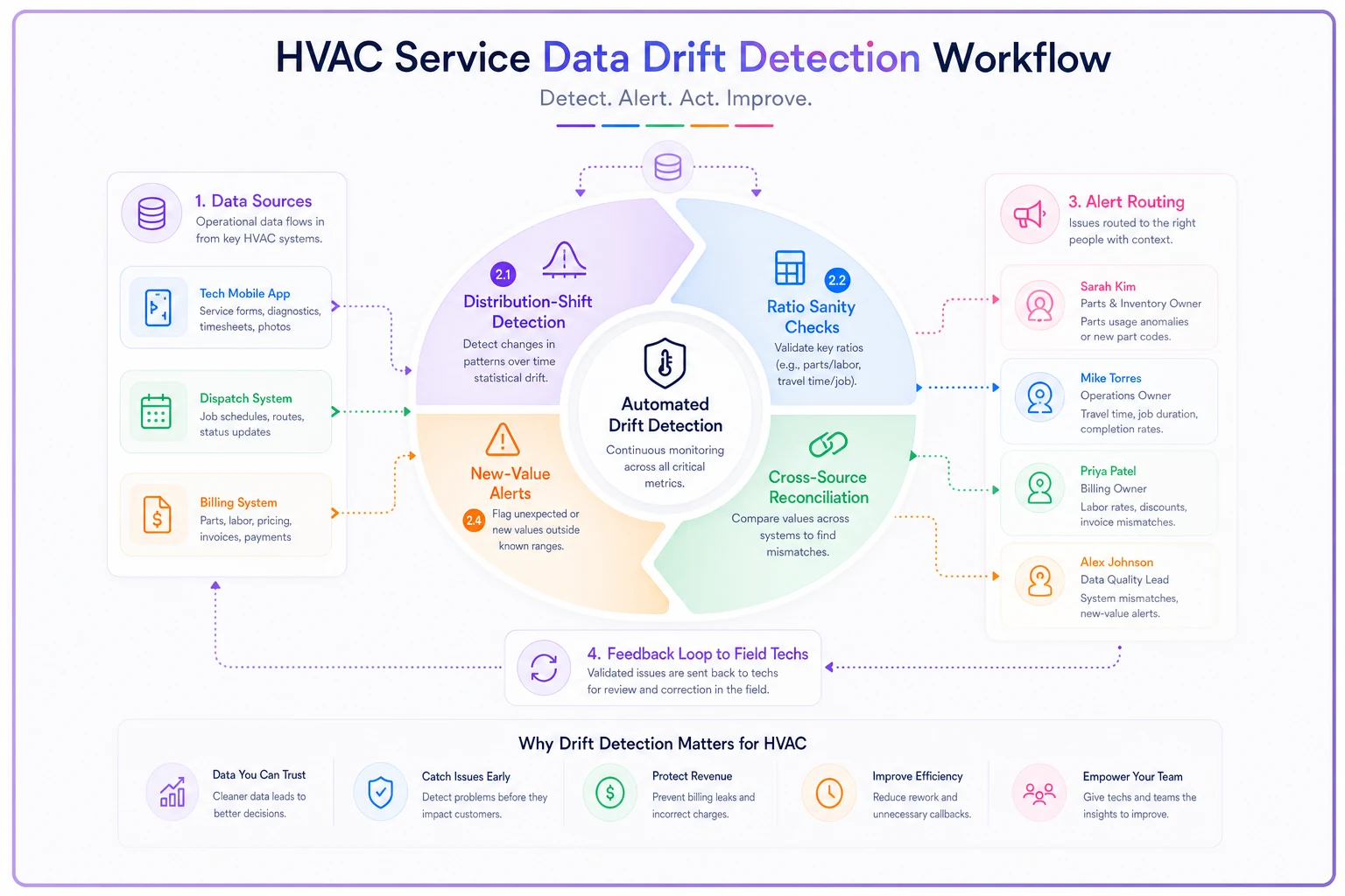
Distribution shift checks. If your job-type mix jumps from 30% maintenance to 55% maintenance in a single week, something's wrong — either a real business change or, more likely, techs suddenly tagging everything as maintenance. Either way it warrants a look.
Ratio sanity checks. A callback rate that drops to near-zero right after you started a callback-reduction push is suspicious, not celebratory. Usually it means callbacks got recoded as new jobs to hide them.
Cross-source reconciliation. Compare payment events against job-completion events. If completed jobs jumped 20% but payments didn't move, either invoicing is lagging or "completed" is being clicked prematurely.
New-value alerts. When a job type or part category appears that isn't in the canonical list, flag it immediately. This is how you catch the "duct cleaning - commercial" one-off before it multiplies into five competing categories.
Modern operational platforms can run these checks continuously in the background and flag the owner when a metric starts drifting — which beats discovering it three months later when the numbers stop making sense. The point isn't the automation itself; it's that drift gets caught while it's still a small correction instead of a full re-tag of six months of history.
Sample governance for metrics you can't measure fully
Some things you can't check on 100% of jobs — post-job quality, comm-log accuracy, whether the tech actually followed the diagnostic sequence. For those, you sample. And sampling needs its own rules or it becomes theater.
-
Random, not convenient. If your QA lead always audits the same three techs, the sample tells you nothing about the other twenty.
-
Stratified by risk. Sample more heavily on high-ticket jobs, new techs, and job types with historically high callback rates.
-
Fixed sample size per period so the metric is comparable week to week. Auditing 40 jobs one week and 8 the next makes the trend meaningless.
-
Documented rubric. Two auditors scoring the same job should land within a point of each other. If they don't, the rubric is the problem, not the tech.
Shops that sample "when they have time" end up sampling never during busy season — which is exactly when quality slips most. Bake a fixed, small sample into every week regardless of load. Even 10–15 jobs sampled consistently beats 100 jobs sampled once a quarter.
Handoff protocols: where numbers go to die
Most metric corruption doesn't happen inside one system. It happens at the seams — when data moves from the tech's app to dispatch, from dispatch to billing, from billing to the accountant.
-
Field → Office. A job can't hand off as "complete" unless job type, parts used, and outcome are all populated. No blank-field completions.
-
Office → Billing. An invoice can't generate until the job passes acceptance criteria — right customer, right job type, parts reconciled against what left the van.
-
Billing → Finance. Revenue only counts against the taxonomy category it was earned in, so month-end margin work isn't a guessing game.
That last handoff is where a surprising amount of margin analysis falls apart. When categories get scrambled between billing and finance, the whole cost-to-serve model and month-end reconciliation becomes unreliable — you can't find hidden margins if you can't trust which bucket the revenue and cost landed in. Clean handoffs upstream are what make honest margin work possible downstream.
A real scenario
A residential-and-light-commercial shop with about 22 techs was running weekly ops meetings off a dashboard nobody fully believed. Their "PM conversion rate" bounced between 18% and 41% week to week, which is nonsensical for a stable business. Every meeting turned into an argument about whether the number was even real.
The root cause was pure definition drift. There was no written rule for when a maintenance visit that turned into a repair got counted — some CSRs logged it as a converted PM, some as a straight repair, some split it into two jobs. Three valid interpretations, zero agreement.
They didn't buy new software or hire an analyst. They did four things: wrote a one-page job-type definition sheet, assigned the PM conversion metric to their CSR lead as sole owner, set an acceptance rule requiring 95%+ job tagging before the metric published, and added a weekly drift check on the maintenance-vs-repair ratio.
Within a couple months the metric settled into a believable 24–29% range and stopped whipsawing. More importantly, the ops meetings stopped being about arguing over the number and started being about acting on it. That's the whole payoff — not a prettier chart, but a number people stop questioning and start using.
When this is worth the effort — and when it isn't
When it makes sense: You've got more than one person entering data, you run regular meetings off dashboards, and you've caught yourself distrusting your own numbers at least once. If any hiring, pricing, or territory decision is riding on a metric, that metric needs an owner and a definition. Full stop.
When it's overkill: If you're a 3-truck shop where the owner personally sees every job, a heavy taxonomy is bureaucracy you don't need yet. Write down your job types so they survive your first big hire, and stop there.
Who should NOT do this: Don't hand taxonomy design to someone who never touches the field data. The best definitions come from the people generating and consuming the numbers arguing it out in a room — not from a consultant's template. A borrowed taxonomy that doesn't match how your techs actually work will drift faster than having none at all, because people will trust it more than it deserves.
Getting started without boiling the ocean
You don't need a six-month project. Start narrow:
-
Pick your three most-argued-about metrics. That's where trust is already broken.
-
Write one-sentence definitions for each, plus the events they depend on.
-
Assign one owner per metric — the person closest to the source.
-
Set one acceptance rule per metric, usually a completeness threshold.
-
Add one drift check per metric and review it weekly.
Pick your three most-argued-about metrics.
That's it for round one. Expand only once those three metrics have gone a full month without someone in a meeting saying "I don't think that number's right."
The shops that get real leverage out of their data aren't the ones with the fanciest dashboards. They're the ones where a manager can point at a number, explain exactly what it means, name who owns it, and defend it when the owner pushes back. A solid HVAC service data taxonomy is what makes that possible — and it's the difference between dashboards that decorate a wall and dashboards you can actually run the business on.
Ready to optimize your HVAC operations?
Join hundreds of HVAC businesses using Coolyly to save time, improve technician utilization, and enhance customer satisfaction.